20 Best Lettermark (Monogram) Logos in the World
In this article, you will learn about twenty of the most iconic first-based logos ever designed and know why they are still so inspiring to designers all over the world.


The visual language of branding has been significantly influenced by lettermark logos and monogram designs. These marks are based on the initials of a brand, which are intentionally made to have immediate recall. A lettermark provides a company with a clean identity since most have long or complicated names, which are easily recognizable to people.
Whether it is global tech giants or luxury fashion houses, lettermark logos show that decades of brand equity can be packed into a few well-thought-out letters in a logo. In this article, you will learn about twenty of the most iconic first-based logos ever designed and know why they are still so inspiring to designers all over the world.
What Is a Lettermark Logo
A lettermark logo is a logo that involves the use of the initials of a brand or one letter to identify the brand. Such a logo is best when the names are long or hard to spell, and the companies want to make their presence easier to remember and to still have a great visual impression. Lettermarks are very reliant on typography, spacing, and balance, and that is the reason why they tend to be timeless and elegant. They are simple to scale, print, and adapt to any medium.
The 20 Best Lettermark Logos in the World
1. IBM
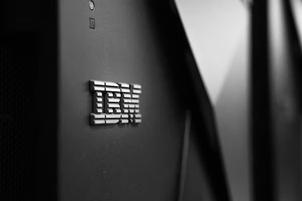
IBM is a global technology and consulting leader known for innovation and enterprise solutions.
Its bold blue initials with horizontal stripes express movement, trust, and forward thinking.
Design Lesson: Stripes and clean lines can turn simple initials into symbols of reliability and progress.
2. Louis Vuitton
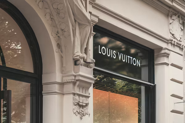
Louis Vuitton is a French luxury fashion brand known to deal with leather products and apparel.
The LV monogram is a symbol of heritage, fashion, and craftsmanship, and it is one of the best-known symbols in fashion.
Design Lesson: Two letters are turned into a classic luxury icon with the help of symmetry and proportion.
3. Google
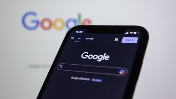
Google is a global technological corporation that specializes in search, software, and digital innovation.
G is showcasing the creativity, accessibility, and open attitude to technology.
Design Lesson: With tactical use of color, one letter is fun, easy to remember, and recognizable at the first sight.
4. Unilever
Unilever is an international consumer goods firm that manufactures food, hygiene, and personal care products.
Its U logo was constructed using a group of small icons representing sustainability, nourishment, and everyday life.
Design Lesson: Adding small symbols within a letter provides narrative and richness, but does not make the logo overloaded.
5. McDonald's
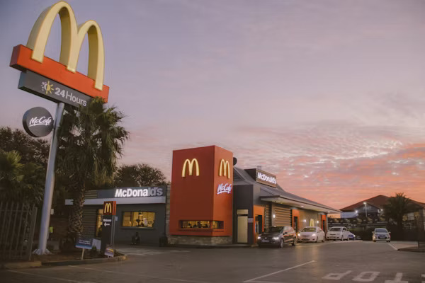
McDonalds is the largest fast-food chain in the world with its international presence and its classic menu.
The golden M arches are now a global icon of fast food and friendly branding.
Design Lesson: Simple, bold shapes can be recognized globally and offer a friendly, familiar surface.
6. Levi's
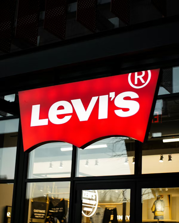
Levi is a legendary denim and lifestyle brand that is linked to rugged quality and American heritage.
Its aggressive red text tag is used to convey the message of toughness, genuineness, and classicism.
Design Lesson: Bold colors and bold typography convey a sense of heritage and strength.
7. Ford
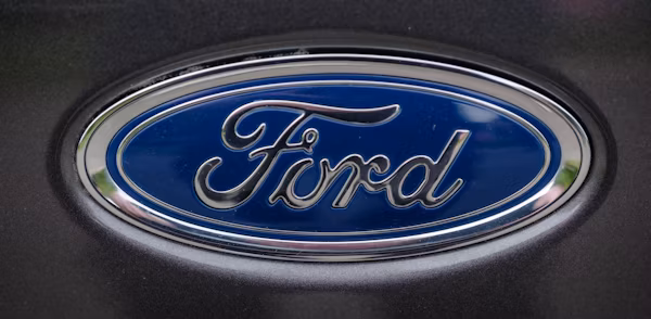
Ford is a legendary motor car company that has over 100 years of international impact.
The classic typeface F is a source of tradition, dependability and the traditional image of the brand.
Lesson in Design: A handcrafted typography creates the impression of trust, history and human touch in a corporate logo.
8. Slack
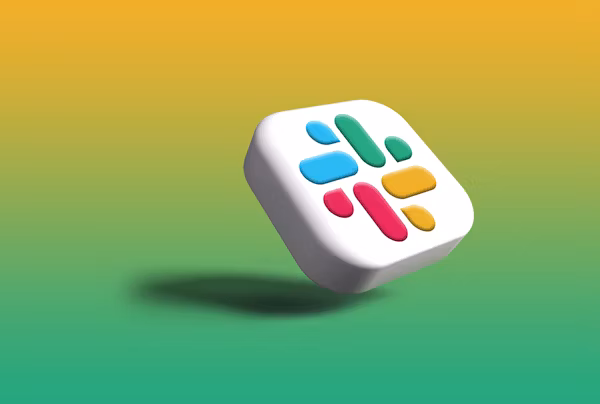
Slack is a recent communication application that teams use to collaborate and manage their workflow.
The message of its colorful S logo is the feeling of a connection, modernity, and the playful digital spirit of the brand.
Design Lesson: Modern forms and bright colors can transform a letter into a moving representation of connectivity.
9. Salesforce
Salesforce is a customer relationship management company based in the cloud, using which businesses can reach their customers.
The S is soft and cloud-shaped to underscore the leadership of the cloud solutions and customer success of the brand.
Design Lesson: Making industry-relevant shapes into initials will not complicate the brand purpose.
10. Dell
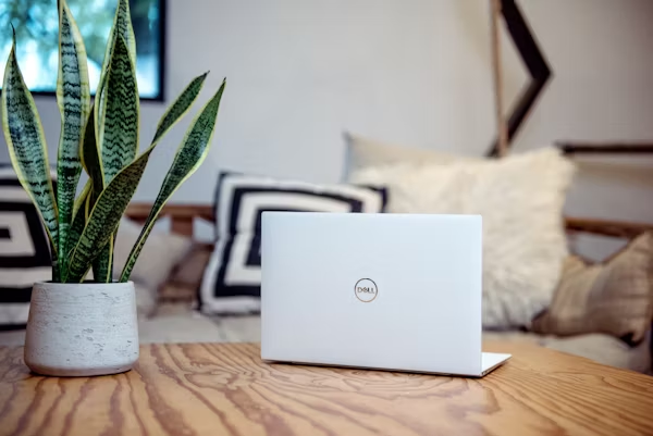
Dell is an international technology corporation that is famous for computers, servers, and innovative hardware.
The tilted E within the D adds a bit of creativity to a plain and reliable mark.
Design Lesson: The slightest changes in the design of the letter can transform a usual first glance into something completely different.
11. Adobe
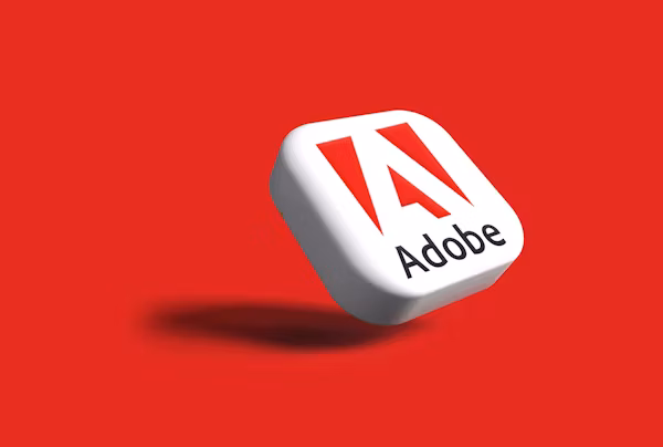
Adobe is one of the most successful software developers that provide creative software like Photoshop and Illustrator.
Its A is stylized and conveys sharpness, fantasy, and daring computer-based artistry.
Design Lesson: Sharp angles and negative space in initials are an expressive implication of creativity and innovation.
12. HBO

HBO is a quality TV and streaming channel that has revolutionary original series.
The aggressive beginning of block initials makes one feel authoritative and confident in entertainment.
Design Lesson: Stylistically daring and small letterforms create credibility and ensure a logo sticks in the minds of media-saturated sectors.
13. HP
HP is a multinational technology corporation that manufactures computers, printers, and business software.
Its lowercase initials are clean and lay out the brand as contemporary, effective, and reliable.
Design Lesson: Simple, curvy typography can be used to make things friendly and corporate.
14. Chanel

Chanel is a French-based luxury fashion company that deals with haute couture clothing, fragrances, and accessories.
The superimposing double C monogram is used as the symbol of exclusiveness, elegance and the ageless grace.
Design Lesson: Interconnected characters make it fancy and support a high-end brand image.
15. Uber
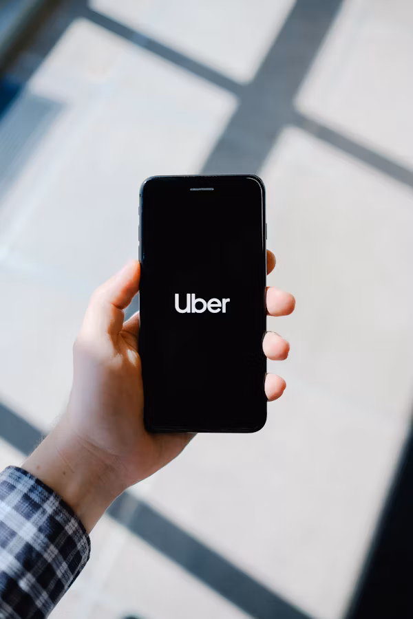
Uber is a multinational transportation firm that deals with ride-hailing and city transportation.
Its minimal U captures the brand's focus on simplicity, modern living, and seamless movement.
Design Lesson: Minimalistic letter-marks create an impression of modernity and high-end urban living.
16. FedEx
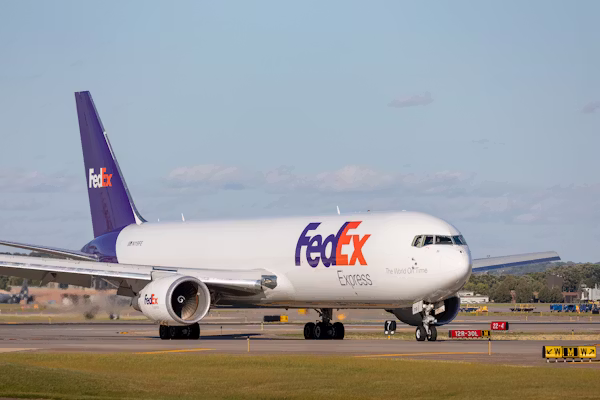
One of the major global courier and logistics firms is FedEx.
The shrewd concealed arrow between the E and the X symbolizes precision, swiftness, and dependability of delivery.
Design Lesson: Negative space used smartly can tell the brand message indirectly but in a strong way.
17. NASA
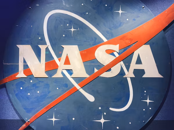
NASA is a government agency of the United States that deals with space exploration and scientific research.
Its red initials are very daring, which leads to curiosity and discovery and human progress.
Design Lesson: Good typography and bright colors can be used to have a sense of power and motivate courage to pursue grand missions.
18. Airbnb
Airbnb is a global platform that connects travelers with unique stays and local experiences.
The distinctive A symbolizes belonging, community, and shared human connection.
Design Lesson: A single letter can embody emotion and social values when paired with a thoughtful design concept.
19. Beats by Dre
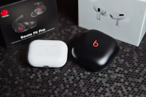
Beats by Dre is an audio company that deals with high-quality sound products and headphones.
Its B is rounded, shaped like two headphones, and conveys rhythm, energy, and contemporary culture.
Design Lesson: The visual storytelling and recognition are enhanced by the alignment of the letter shape with the category of the product.
20. Netflix
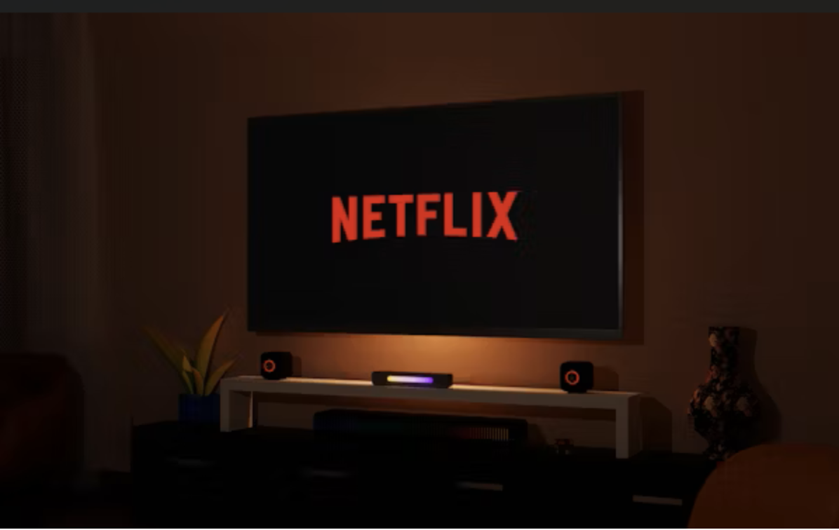
Netflix is one of the largest entertainment services, which provides films and shows, as well as award-winning original content.
The N is a ribbon-like symbol that is bold and symbolizes the fast-moving streaming world.
Design Lesson: Motion-inspired letterforms can give static initials a sense of energy and cinematic appeal.
Key Design Principles of Lettermark Logos
The most successful lettermark logos are constructed on good design principles. Typography is the key factor since the whole image is defined by the design of the initials. Color psychology provides an emotional input, assisting brands to convey trust, excitement or luxury. Minimalism will help the logo to be crisp and unforgettable, particularly when being used online. Scalability is the property that guarantees that the design can be used on the largest billboards up to small app icons.
How to Create an Effective Lettermark Logo
Begin with the selection of a typeface matching the tone of the brand. Refined serif is elegant and geometric sans serif is modern and clean. Keep all proportions in balance in order to make the initials appear united and harmonized. Choose a color scheme that favors the brand message without too much clutter and ornamentation. Most importantly, the logo must match the story of the brand in order to make it relevant and immortal.
Why Lettermark Logos Work Well for Branding
Lettermark logos are effective as they are short, memorable, and flexible. They assist consumers in recognizing a brand in the shortest time, even in saturated markets. This is because of their simplicity, which enables them to be consistent both in the digital and print media. Lettermarks are preferred by many companies as they are clear, flexible, and long-term. These marks that are initially based in technology, fashion, or food service still demonstrate their strength.
Conclusion
Lettermark logos demonstrate that powerful branding can come from simple but thoughtful design. When crafted with care, just one or two letters can express a company’s values, style, and vision. These twenty examples demonstrate how initials can become cultural symbols that are known on the other side of the world.
To gain further insight and inspiration on branding, as well as professional advice, visit even more materials at X-Design' s AI logo generator and find more ideas on how to make such a memorable logo that will stand the test of time.
Frequently Asked Questions
What is the difference between a lettermark and a monogram
A lettermark uses initials for brand identity, while a monogram often blends overlapping letters in a more decorative style, especially in fashion and luxury branding.
How do you design a lettermark logo
Choose a suitable typeface, refine the spacing, study the overall balance, and align the design with the brand’s personality.
Which famous brands use lettermark logos
Brands such as IBM, Google, Chanel, FedEx, and Netflix are known for their influential initial-based logos.
Are lettermark logos good for small businesses
Yes, they do make it easier to spell out long business names and give a clean and professional identity in the very beginning.
What mistakes should be avoided
Do not use unnecessarily complicated typography, redundant symbols, ineffective spacing, and designs that do not work well at a smaller size.
Related articles

How to Design a Good Advertising Poster

Human vs. AI in Design: Who Really Creates Better Art?

The Difference Between Motion Graphics and Animation: A Detailed Analysis
