9 Types of Logos You Must Know Before Designing
This article is a discussion of 9 significant categories of logos, their explanations, design, case study examples, a checklist, and common questions that may be asked during the process of designing a logo.


A logo is the face of a brand. It is a major factor shaping the perception of a business as it is usually what a customer thinks of it in the first place. The appropriate logo is not only attractive but it also conveys the values, personality and trustworthiness of the brand. Regardless of whether you are creating a new business or are updating an existing brand, one of the most essential creative choices that you can make is the type of logo that you use.
Knowing the various logos assists designers and enterprises in making wise decisions that resonate with the brand identity. This article is a discussion of 9 significant categories of logos, their explanations, design, case study examples, a checklist, and common questions that may be asked during the process of designing a logo.
- What Are the Types of Logo
- Why Understanding the Kinds of Logo Matters
- The Nine Types of Logos
- 1. Wordmark Logo
- 2. Lettermark Logo
- 3. Letterform Logo
- 4. Pictorial Mark Logo
- 5. Abstract Mark Logo
- 6. Emblem Logo
- 7. Mascot Logo
- 8. Combination Mark Logo
- 9. Dynamic Logo
- Logo Design Checklist
- Case Studies
- Frequently Asked Questions
What Are the Types of Logo
Types of logo is a term that is used to describe the style or structure of the visual representation of a brand. Every logo is directed at the same object, in order to make the brand recognizable, although it is accomplished in different ways. Some logos are typographic and use this to demonstrate themselves; others are made of symbols or abstract images. Knowledge of these differences will render the logo suitable to the brand personality, target audience, as well as business objectives.
Why Understanding the Kinds of Logo Matters
Using the inappropriate form of a logo may influence the brand recognition, perception of the audience, and flexibility. To illustrate, a small business can use a plain text based logo to make itself better known, whereas a global brand might need a visual image that is recognizable by everyone.
The nature of the logo also influences the scalability and usability both in digital and print mediums. Complex symbols can be decreased in meaning when reduced to a mobile-phone application and simple abstract symbols may not be able to evoke emotion without careful design. Being aware of the advantages and disadvantages of each type will assist in getting your logo to work well in any application.
The Nine Types of Logos
1. Wordmark Logo
Definition
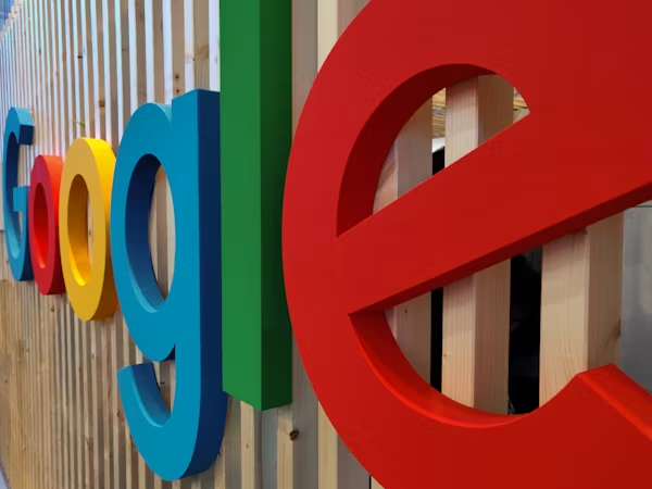
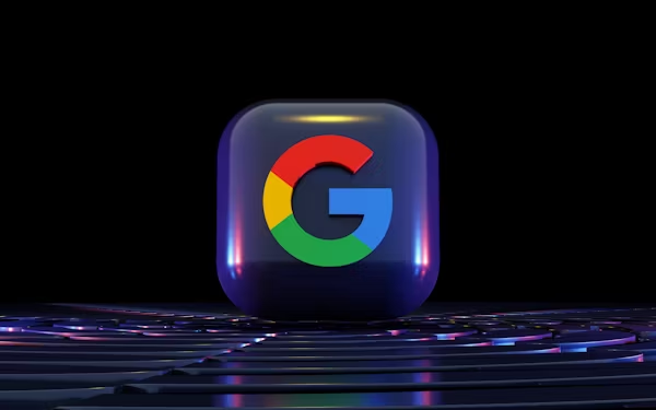
A wordmark logo uses the full brand name in a stylized or custom typeface. Examples include Google, Coca-Cola, and Visa.
When to Use
Ideal for companies with short and memorable names that want to focus on building name recognition.
Advantages
Directly highlights the brand name
Simple, clean, and versatile across media
Works well for websites, social media, and marketing materials
Disadvantages
Does not include a visual symbol
May be less effective for very long or complex names
Design Tip
Select a font that conveys your brand tone. Individualize letters or typography to make the wordmark unique and memorable. It is also necessary to use such a color to convey such a personality as elegance, playfulness, or professionalism.
2. Lettermark Logo
Definition
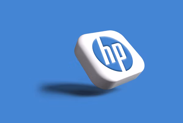
Lettermark logos can also be referred to as monogram logos, and are merely the initial letters of the brand name. Examples are IBM, CNN, and HP.
When to Use
Most appropriate in situations with a long or complicated business name, and should have a brief identity.
Advantages
Minimal and professional
Easy to scale and adapt across formats
Creates a modern and clean appearance
Disadvantages
Depends on brand recognition
Does not communicate the business type directly
Design Tip
Use distinctive typography or arrangement of initials to make the lettermark unique. Incorporate subtle design elements to add personality without compromising readability.
3. Letterform Logo

Definition
A letterform logo uses a single letter, usually the first letter of the brand name, as the visual mark. Examples include Netflix and McDonalds.
When to Use
Suitable for brands with strong recognition or those seeking a minimalist identity.
Advantages
Simple and highly versatile
Recognizable at small sizes such as app icons or social media profiles
Can stand alone once the brand is established
Disadvantages
Limited storytelling capability
Needs existing recognition to be fully effective
Design Tip
Pay attention to proportions, spacing, and negative space. A well-designed single letter can become a powerful symbol representing the brand.
4. Pictorial Mark Logo
Definition
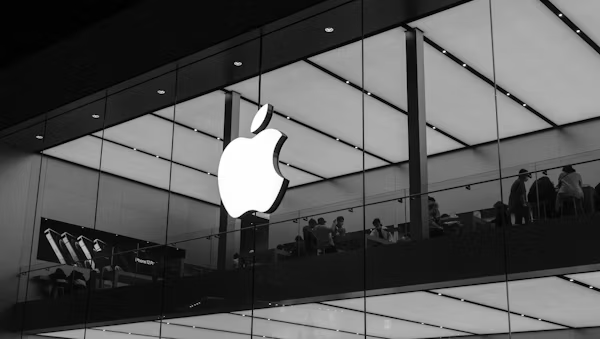
A pictorial mark logo is a recognizable image or icon that is used to represent the brand. Such are the Apple logo and the Twitter bird.
When to Use
Best when the brand wishes to have a strong visual or international presence.
Advantages
Visually memorable
Works across languages and cultures
Effective for digital apps and physical products
Disadvantages
May require supporting text for new brands
Meaning might not be obvious without context
Design Tip
Select a simple, timeless icon that communicates the brand message clearly. Avoid overcomplicated details that may reduce clarity.
5. Abstract Mark Logo
Definition
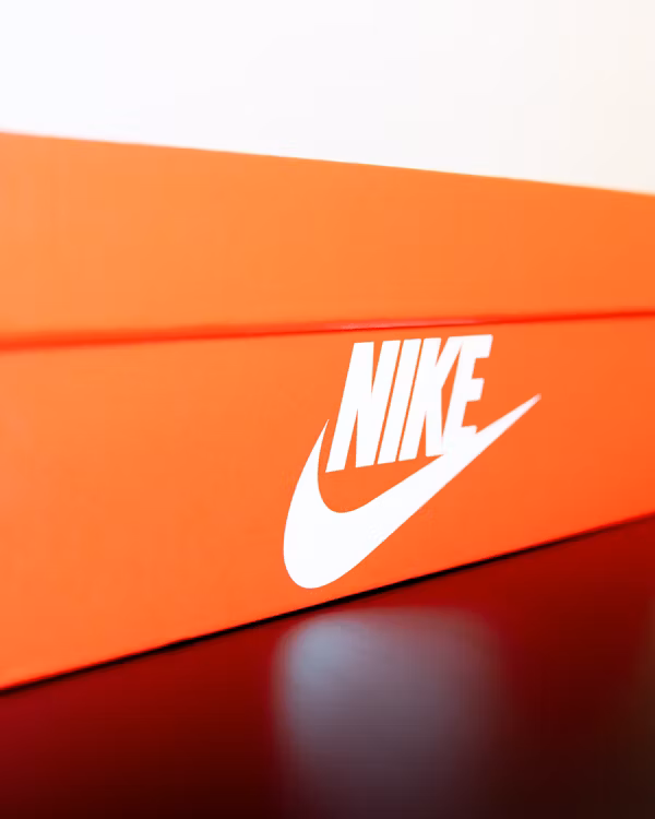
An abstract mark logo involves the use of geometrical forms or abstract images to define a brand. Examples are the Nike swoosh and the Pepsi circle.
When to Use
Appropriate for brands that demand a unique, creative, and flexible visual identity.
Advantages
Unique and distinctive
Conveys ideas, emotion, or motion
Highly versatile across formats
Disadvantages
Recognition takes time to build
It may be unclear without marketing support
Design Tip
Use balance, geometry, and color theory to create a visual symbol that reflects your brand personality and values.
6. Emblem Logo
Definition
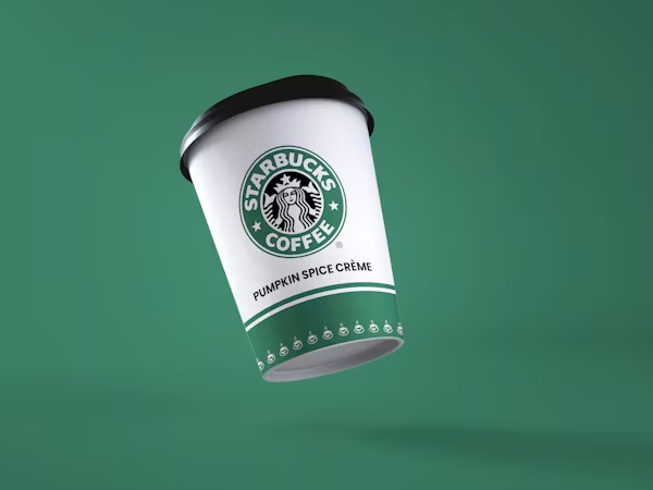
Emblem logos combine text and imagery in a unified design, often appearing as a badge or seal. Examples include Starbucks and Harley-Davidson.
When to Use
Best for brands that want a formal, established, or heritage feel.
Advantages
Conveys professionalism and authority
Provides a classic and detailed appearance
Suitable for official documents or products
Disadvantages
Can lose clarity in small sizes
Complex design may not scale well for digital icons
Design Tip
Simplify internal elements to maintain legibility and balance. Ensure text is readable across all sizes.
7. Mascot Logo
Definition
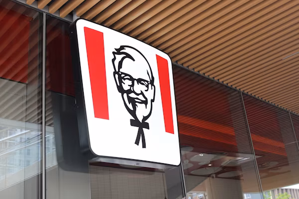
Mascot logos use illustrated characters to represent a brand. Examples include KFC’s Colonel Sanders and Tony the Tiger.
When to Use
Best for brands seeking a fun, approachable, or family-friendly image.
Advantages
Adds personality and emotion
Strong tool for storytelling and campaigns
Disadvantages
Not suitable for luxury or professional brands
Requires consistent use to maintain identity
Design Tip
Design mascots to be adaptable across formats and marketing campaigns while communicating brand values.
8. Combination Mark Logo
Definition
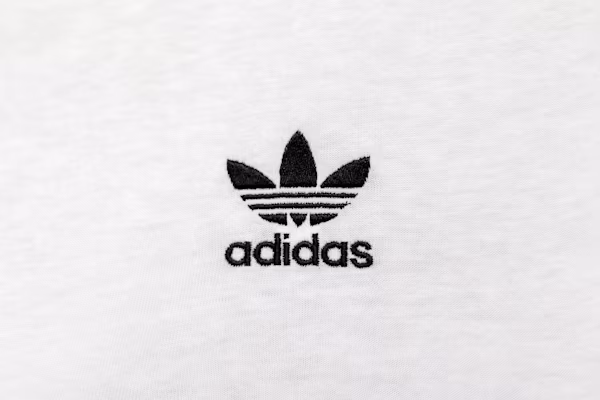
A combination logo is one that combines text and a symbol in order to form a flexible brand identity. Some of them are Adidas, Burger King, and Lacoste.
When to Use
Best suited to brands that desire visual awareness and brand name recognition.
Advantages
Offers flexibility in usage
Supports both textual and visual recognition
Disadvantages
May seem messy when space and alignment are not properly handled.
There must be a delicate balance between text and symbol.
Design Tip
Make sure that there is space and proportion. Text and symbol must be complementary to each other to have a clean design.
9. Dynamic Logo
Definition
Dynamic logos is one that varies with context, such as colour, the composition or motion. Some of them are Google doodles and MTV logos.
When to Use
Best in case of modern brands that require flexibility in campaigns and platforms.
Advantages
Engaging and interactive with the digital audiences.
Scalable to various situations and marketing materials.
Disadvantages
Needs regular regulations to ensure brand recognition.
Technical management is complicated.
Design Tip
Maintain a consistent core logo that makes them consistent even when changes are implemented.
Logo Design Checklist
A professional logo must meet the following criteria:
Scalability
The logo should remain clear and identifiable on all sizes, from small business cards to large billboards.
Simplicity
Avoid unnecessary details that make the logo cluttered. Simple logos are memorable and versatile.
Readability
Text elements must be legible at all sizes.
Color Versatility
Prepare versions for black and white or monochrome use to ensure adaptability.
Consistency
Use consistent spacing, alignment, and proportions across all variations.
File Formats
Keep high-quality digital and print versions in SVG, PNG, and PDF to maintain clarity across platforms.
Case Studies
Coca-Cola
Coca-Cola is operating under a wordmark logo having a classic typeface. The logo conveys personality, emotion, brand heritage, and typography has power.
Nike
The abstract swoosh used by Nike is easily identifiable at a global scale. The shape is very simple, but it expresses a feeling of movement, power, and ambition.
Starbucks
Starbucks began with a logo of an emblem that had elaborate drawings. With time, the brand reduced its brand name to a pictorial image as a way of improving its clarity and international identity.
Conclusion
A logo does not simply constitute a pictorial image. It is a strategic tool that tells your brand narrative in the second place. The 9 types of logos, professional design checklist, and case studies are what will help you make a better design choice.
Wordmark, mascot, abstract mark, dynamic logo, there is no good and bad, but every kind has its benefits and application. In case the designers and business owners have the desire to go an extra mile and experiment with their logos, you can apply professional tools like the X-Design logo generator to create logos that will suit your brand image.
Frequently Asked Questions
What are the main types of logos?
Primary logos include wordmark, lettermark, letterform, pictorial, abstract, emblem, mascot, combination, and dynamic logo. All types are targeted at different functions based on brand objectives.
Which logo type is best for startups?
Startups tend to work best with wordmark and combination logos as they establish the name recognition and the visual identity.
Can a logo type change over time?
Yes, most brands change their logos as they develop. As an illustration, Starbucks shifted away from its elaborate logo to a picture logo.
Are animated logos better than static logos?
The animated or dynamic type of logo can be used in the digital world, whereas a print or consistent brand must have a fixed version.
How do I know which logo type suits my brand?
Consider your brand personality, target audience, platform, and recognition. Use various forms of logos to determine which one represents you in the best way possible.
Related articles

How to Design a Good Advertising Poster

Human vs. AI in Design: Who Really Creates Better Art?

The Difference Between Motion Graphics and Animation: A Detailed Analysis
