What Is a Pictorial Mark Logo and 30 Famous Examples
A pictorial mark is easily identifiable and highly memorable when done correctly, which is ideal in digital icons, packaging, signage, etc.


A pictorial mark logo is an effective branding tool that represents a company with the help of a simple icon or image. This kind of logo is the visual shorthand of a brand without the use of any text. A pictorial mark is easily identifiable and highly memorable when done correctly, which is ideal in digital icons, packaging, signage, etc.
- What Is a Pictorial Mark
- How Pictorial Marks Differ from Other Logo Types
- The Power of Pictorial Marks.
- Design Principles for Effective Pictorial Marks
- Brand Launch Strategy: How to Introduce a Pictorial Mark
- Trademark and Legal Checklist for Pictorial Marks
- 30 Famous Pictorial Mark Logo Examples
- Launch Strategy for Your Brand
- Checklist: Is Your Pictorial Mark Ready?
- Conclusion
- People Also Search For
What Is a Pictorial Mark
A pictorial mark (also called a brand mark or logo symbol) is a logo made only of an image. It is not dependent on words or letters. Instead, the picture usually says something significant about the brand, a product, a value or an abstract idea in a simplified, stylized manner. As time passes, after using it regularly, individuals start associating the icon itself with the brand.
How Pictorial Marks Differ from Other Logo Types
Pictorial marks are placed together with other logo types but they have another role.
Wordmark: The logo is the brand name itself, styled or customized in a special font.
Combination mark: A picture and text in one; It is applicable in the launching of a brand where the identity is constructed both visually and verbally.
Abstract mark: A purely geometric or non-literal shape that carries symbolic meaning rather than depicting a real-world object.
Pictorial marks bridge literal imagery and brand storytelling in a way that is both direct and emotionally resonant.
The Power of Pictorial Marks.
Visual Recognition and Visual Memory
Humans process images faster than text. A good pictorial mark is memorable, even more effective than a name. A logo that is reduced to a completely plain and simple form may turn into a universal icon that cuts across language boundaries.
Versatility Across Media
Scaling pictorial marks is incredibly good because they are compact. They operate on small digital platforms such as icons on apps or browser tabs, as well as large physical platforms such as storefront displays. Their simplicity also tends to enable them to be reproduced in a single color, and in this way they do not have to disrupt the visual consistency.
Cross-Cultural Appeal
When it comes to communication across the world, icons can be more effective than words. A carefully selected pictorial mark may prevent the danger of translation problems, particularly when the symbol is universally recognized or the brand adapts it to various cultural backgrounds.
Design Principles for Effective Pictorial Marks
Simplicity: reduce the icon to the simplest form that can be identified at low scale.
Good Outline: An outline is recognized, and the mark is recognizable even in the absence of colour.
One-Color Testing: Ensure that the logo is printable in black and white; it is useful in printing, embossing, embroidery, and other technical applications.
Negative Space: The negative space should be used in a creative way to add meaning or visual interest without making the form complicated.
Scalability Testing: Try the design at very small sizes (for example 16×16 pixels) and at large sizes to ensure fidelity.
Cultural Sensitivity: Research how the image would be viewed in various markets to prevent unintentional interpretation.
Legal Clearance: Conduct a trademark or visual similarity check before the final design is finalized to minimize the chances of infringement.
Brand Launch Strategy: How to Introduce a Pictorial Mark
In case the company is new, it may be a risk to launch with only the image because there is no recognition. A recommended strategy is:
Begin with a combination mark (icon + wordmark) at launch.
Use the combination version in marketing materials, packaging, and introductory campaigns.
Overtime transition to the pictorial mark only when the brand becomes more recognizable.
Be brand consistent: When the wordmark is discontinued, the pictorial mark must always adhere to the same design principles (color, spacing, shape).
Review after a period: When the brand develops, it is necessary to review the mark after a certain period to determine whether it requires minor changes to make it clear or culturally appropriate.
Trademark and Legal Checklist for Pictorial Marks
Do visual trademark research in the jurisdiction where you intend to conduct business to ascertain that there are no other similar marks.
Consider hiring an intellectual property attorney to assist with registration in the relevant trademark classes.
Register the color version of the mark where possible.
Keep design files and documentation (sketches, vector files) so they can be used later in trademark filings or as a source of design dispute.
Keep an eye on new marks that are likely to infringe your design in the market and enforce your rights to the trademark where necessary.
30 Famous Pictorial Mark Logo Examples
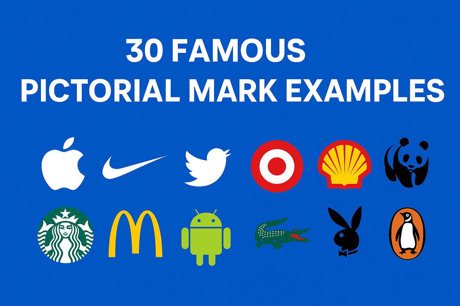
Here are thirty well-known brands that use pictorial marks. Each icon is a visual symbol deeply embedded in the brand identity.
Apple
The silhouette of the bitten apple is clean, simple, and immediately associated with consumer technology. It represents creativity and high-quality design.Nike
The swoosh is dynamic and moving indicating motion, speed, and athleticism. It operates efficiently on footwear, clothing and marketing campaigns.Twitter (now X)
The stylized bird represents communication, tweeting, and social interaction. It became iconic for the way users connect.Target
The simple bullseye captures the retail focus and precision of the shopping experience. It is bold, easily recognizable, and clean.Shell
The scallop shell reflects heritage and links to energy and fuel industries. The form is distinctive and well suited for signage and packaging.WWF
The panda symbol is emotionally resonant, and the symbol is connected to wildlife protection and compassion. The black-and-white contrast of the design is eternal.Starbucks
The siren (mermaid) figure taps into mythology and coffee tradition. Over time the icon has been simplified while retaining its powerful identity.McDonald’s
The golden arches evoke architecture and human scale. These arches are now a universal sign for fast food and convenience.Android
The friendly robot character conveys a sense of openness, modern technology, and accessibility. It works across devices and applications.Lacoste
The crocodile was inspired by the founder’s nickname. It communicates elegance, heritage, and exclusivity, especially on apparel.Playboy
The rabbit head is stylized, bold, and unmistakable. The mark has migrated beyond its original market to become a fashion and lifestyle icon.Penguin Books
The penguin icon evokes approachability and trust in publishing. It connects readers with the legacy and playfulness of the brand.Dropbox
The open box image suggests sharing, storage, and accessibility. It is a clean metaphor that works well in digital and physical contexts.BP
The flower-like “Helios” symbol ties to energy and environmental values. The design is both geometric and organic, blending strength with sustainability.Spotify
Circular sound waves within a circle evoke streaming, music listening, and movement. The shape scales effectively for mobile interfaces.Snapchat
The ghost is playful and memorable, capturing the ephemeral, fun nature of the app’s messaging experience.NBC
The peacock silhouette with colorful feathers once symbolized the network’s early adoption of color television. It is now a classic media icon.Mercedes-Benz
The three-pointed star stands for mobility across land, sea, and air. It conveys precision engineering and luxury.Audi
Four interlocked rings represent unity and strength. The design is simple yet deeply tied to the brand’s history and identity.Olympic Games
The five interlocking rings represent the unity of the world’s continents. The symbol is globally recognized and powerful in its simplicity.KFC
The Colonel Sanders silhouette ties directly into the brand’s origin. It is friendly, nostalgic, and immediately recognizable on packaging.Puma
The leaping cat suggests agility, power, and athleticism. It is sleek, dynamic, and perfect for sportswear and footwear.Red Bull
Two charging bulls portray energy, competition, and strength. The image is bold and consistent across events and product packaging.Mozilla Firefox
A fox curled around a globe conveys speed, exploration, and the global nature of the internet. The form is stylized yet descriptive.Baskin-Robbins
The combined “BR” includes the number 31 (for its 31 flavors) in a clever, playful way. The mark blends imagery and typography creatively.Starbucks (evolution)
Over its history, the siren mark has gradually simplified. The most recent design keeps only the essential elements while staying true to the brand.Toyota
Three overlapping ellipses form a symbol that stands for trust, innovation, and global reach. It is elegant and symmetrical.IKEA
A bold shape with simple geometry evokes the modular, flat-pack, no-fuss furniture philosophy and supports strong in-store identity.Ferrari prancing horse
The horse embodies speed, luxury, and performance. This iconic silhouette is tied to the automotive legacy and racing pedigree.BP Evolution
The updated Helios flower symbol represents the shift toward greener energy. It is more refined and visually balanced than older versions.
Launch Strategy for Your Brand
Begin with a combined version of your pictorial mark and a wordmark to build awareness. Use both in your early brand materials, such as packaging, business stationery, and advertising. When your brand is more well-known, switch to the pictorial mark in apps, icons, and other simplified branding. Re-examine the design periodically to ensure that it remains viable in other scales and media.
Checklist: Is Your Pictorial Mark Ready?
Test at very small sizes (for example as a favicon)
Confirm that it is legible in one color
Review silhouette clarity—can someone sketch it from memory?
Run cultural checks in target markets
Perform a trademark/visual search
Keep vector files and sketch documentation for legal registration
Conclusion
One of the strongest and most beautiful tools in branding is pictorial mark logos. Companies create a natural and memorable recognition by transforming the essence of a brand into a simple and bold visual image. A pictorial mark when planned thoughtfully, culturally and with long-term strategic intent will be a lasting asset that expands with the brand.
To get professional assistance in creating or improving your pictorial mark, you can review the portfolios and case studies of X-Design. They have their team of experts in identity systems and can assist you in your concept, testing, and implementation. Ready to create a powerful pictorial mark? Try the X-Design AI Logo Generator and start building your brand instantly
People Also Search For
What is a pictorial mark logo
A pictorial mark logo is a symbol-based logo made from a simple image or icon without text. It represents the brand through a visual element that becomes recognizable with consistent use. Popular examples include Apple’s apple and Twitter’s bird.
How to make a pictorial logo
The first step is to define your brand and then find a visual representation of that specific idea. Draw simplified figures, clean up the shape, test at tiny sizes, and make sure that the design is right in one color. After the mark is in a recognizable state that is easy to remember, complete the mark in the vector format and conduct a trademark research.
What is the difference between a logomark and pictorial mark
Any logo based on a symbol is generally referred to as a logo mark. A pictorial mark is a particular logo mark where a recognizable image like an animal, fruit or object is used. Pictorial marks all belong to the category of logo mark, although not every logo mark is a pictorial mark.
What are the 7 types of logos
The seven most frequently known types of logos are wordmarks, letter marks, pictorial marks, abstract marks, mascots, combination marks and emblem logos. All styles have advantages based on the needs of the brand in terms of identity and visibility.
What is an example of a pictorial mark
The easiest example is the Apple logo that uses an uncluttered apple figure to identify the brand. Others are the bullseye used by Target, the bird used by Twitter, and the shell used by Shell. These signs do not consist of letters or words but images.
Why do brands use pictorial logos
The reason why brands use pictorial logos is due to the fact that they are easier to recall and faster than text. One symbol can convey values, personality and recognition between cultures. Pictorial marks are also easy to scale and occur best in digital icons, packaging or signage.
Related articles

How to Design a Good Advertising Poster

Human vs. AI in Design: Who Really Creates Better Art?

The Difference Between Motion Graphics and Animation: A Detailed Analysis
