What Makes a Good Logo? Tips, Rules, and More
Try Now For FreeAre you starting a business? Or, do you want to redesign your existing logo? If yes! This post is for you. Everyone understands what a logo is. But the main question is, “Is it a good one?” This is a serious part where many fail. The problem is that everyone is behind in following the design process. However, the main elements of a good logo are avoided. Don’t worry! You don’t have to be one of them. Today, you will learn the essence of “What makes a good logo?”
After completing the reading, you will be able to create the ideal logo. It will be suitable for your different needs. Let’s see how to make it fit for your audience and goals.
- Main Goal of a Good Logo
- 5 Design Principles of a Logo Design
- 10 Elements in a Good Logo Design
- Valuable Tips to Design a Good Logo
- X-Design’s AI Logo Generator Tool as a Logo Design Tool
- FAQs
- Conclusion
Main Goal of a Good Logo
A logo is the face of a brand. It is what people see first. On the other hand, a good logo creates a connection. It keeps the engagement between the brand and the audience. Also, a good logo helps people recognize the brand. It should communicate the brand message in a simple way. And every brand must use it to make an impact.
Besides, the main goal of a good logo is to make the brand memorable. It is not possible for everyone. Especially with the wrong tools. People should remember it. A good logo can work in different places. For example, your websites, business cards, and products. So, a logo should fit and be recognizable even in small sizes.
A good logo also builds trust. It shows that the brand is consistent and reliable. People feel confident when they see a clear logo.
Here are some points to consider about the goal of a good logo:
It should represent the brand clearly.
It should be easy to remember.
It should work in all formats.
It should connect with the audience.
Understanding what makes a good logo helps brands create one that lasts. The logo becomes the main symbol of the brand.
5 Design Principles of a Logo Design
Logo design principles matter when you create a logo. These principles guide you in making a good logo. The one that works well and connects with your audience. If you ask yourself what makes a good logo, these five principles can give you clear answers.
1. Simplicity
A simple logo is recognizable. It does not have too many elements. The details will be limited. Simplicity helps people remember your brand. However, a complex logo can confuse the audience. Simple shapes work the best. Keep this in mind when you design a logo. You should focus on the core idea. It is great to make ideal logos in various sizes.
2. Memorability
A good logo is easy to remember. People see it once. And they should recall it later. Memorable logos leave an impression. Your audience loves it. Here, you need to show your idea. But with clear symbols. Please avoid copying other logos. Think about what makes a good logo. And how it can stick in someone’s mind.
3. Relevance
Your logo should reflect your brand. It should connect with your industry. And easily inspire your audience. Relevance builds trust. It lets your audience understand you. Colors and symbols can show what your business does. A logo that does not match your brand can confuse people. So, ask yourself if every element matches your business.
4. Versatility
A logo should work in many places. It should look good in black and white. The logo must also look brilliant in color. It should work on screens. Also, it should look good in print. A versatile logo keeps its clarity in all sizes. You may need it on a business card. Or, you need it on a large banner. Thus, check how your logo performs in different uses.
5. Timelessness
A logo should last for years. Avoid following short-term trends. A timeless logo does not feel old after a few years. It should grow with your business. Think about logos you remember from the past. Most of them use these design principles. So, focus on a logo that creates a lasting impression.
10 Elements in a Good Logo Design
When we talk about what makes a good logo, there are many factors that go beyond the usual rules. A logo is more than a symbol. It communicates your brand to the audience. Here are ten design elements to consider.
1. Color Choice
It affects audiences’ emotions. A hue tells a story without words. Different colors send different messages. Choosing the right colors matters. It helps customers connect with your brand. Colors can guide attention and create recognition.
2. Typography
The style of the letters matters. Fonts speak about your brand. Some fonts feel strong and stable. Others feel soft and flowing. Typography must be clear and readable at all sizes.
3. Shape
Shapes carry meaning. Circles show unity. Squares show structure. Triangles show direction. The shape you pick tells the audience something about your brand without using words.
4. Spacing
Space between elements is important. It helps the logo breathe. Crowded elements can confuse the audience. Proper spacing makes the design easier to understand.
5. Alignment
Alignment keeps the logo organized. It makes the logo feel balanced. Misaligned elements can create tension. Proper alignment guides the eyes naturally across the logo.
6. Proportion
The size of each element matters. Large elements grab attention first. Smaller elements support the main message. A good proportion makes the logo feel complete.
7. Contrast
Contrast separates parts of the logo. Dark and light areas create focus. It helps customers notice the most important elements first. Contrast also improves visibility on different backgrounds.
8. Line Quality
Lines define edges and shapes. Thick lines draw focus. Thin lines add detail. Consistent line quality keeps the logo looking connected and intentional.
9. Texture
Texture can create depth. Flat textures feel different from rough textures. Texture can guide the audience’s perception of the brand.
10. Balance
Balance gives the logo stability. Elements should feel even. A balanced logo feels strong and structured. It keeps the design from looking awkward or uneven.
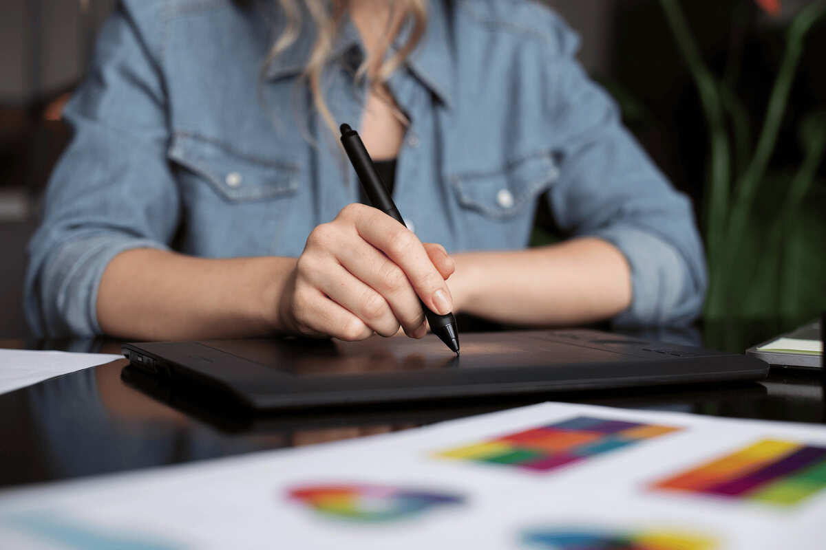
Valuable Tips to Design a Good Logo
Start with Research: Study your audience. Look at competitors. Understand what works in your industry. This helps answer the question of what makes a good logo. A logo should connect with people immediately.
Focus on Concept: Think of a story behind your logo. Symbols or shapes should have a meaning. Avoid adding elements that do not serve a purpose. Every line and curve should tell something.
Play with Space: Use empty space smartly. Negative space can create hidden shapes. This gives depth to your logo. Space makes the logo readable. It also creates curiosity.
Test in Black and White: Colors are important, but first see the design in black and white. A good logo works without color. This proves what makes a good logo versatile.
Use Geometric Balance: Shapes should feel aligned. Symmetry helps the eye follow naturally. The logo should feel stable and easy to look at.
Think About Future Use: Your logo should fit all platforms. From app icons to billboards. Plan for resizing and printing.
Seek Feedback: Show your logo to people outside your circle. Fresh eyes reveal hidden problems. Adjust based on honest opinions.
X-Design’s AI Logo Generator Tool as a Logo Design Tool
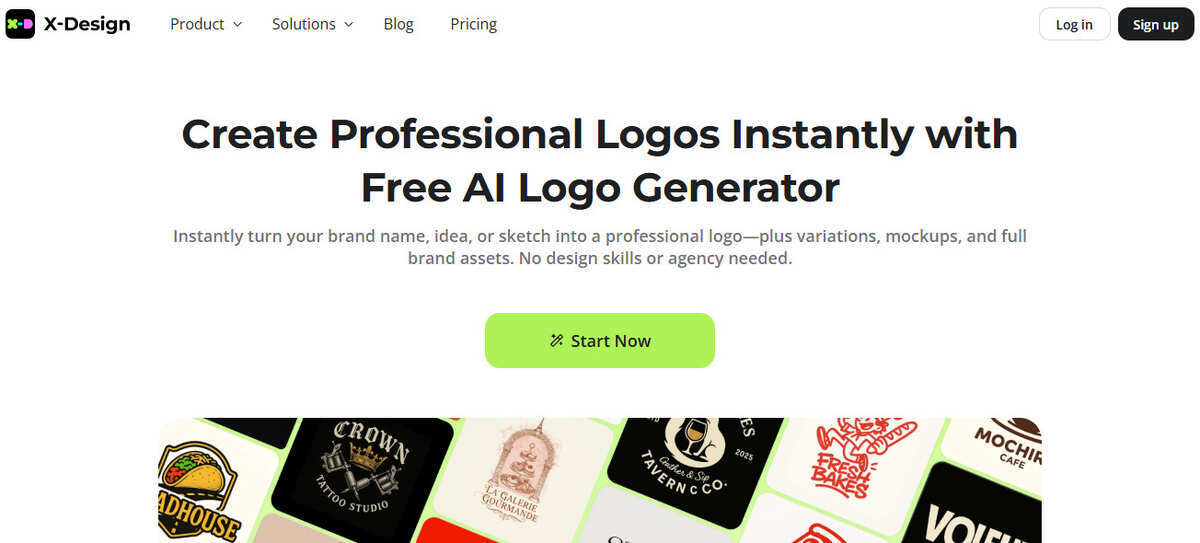
X-Design offers an AI logo generator that makes the process simple. You can start with your brand name. The AI will suggest ideas. You can see multiple designs in minutes. It saves time and effort.
The tool focuses on what makes a good logo. A good logo is simple. It is clear and easy to remember. It communicates the brand message. It works in all sizes. It looks good in black and white. X-Design ensures these points are covered.
How X-Design Helps:
Enter your brand name and industry.
Choose the style and color options.
The AI generates multiple logo ideas.
You can edit fonts and symbols.
Download the final design in high quality.
X-Design guides you through each step. You do not need design skills. It gives results fast. The logos are ready for websites, social media, and products. The AI focuses on key elements of what makes a good logo. This ensures your brand stands out.
FAQs
1. What makes a good logo for a new business?
A good logo should show what your business does. It should be simple and easy to remember. It should work on all platforms. It should help people recognize your brand quickly.
2. What makes a good logo color choice?
A good logo color should match your brand message. It should stand out but stay consistent. It should work in black and white, too. People should notice it easily.
3. What makes a good logo font?
A good logo font should be easy to read. It should fit the style of your brand. It should not be too complex. It should work on small and large screens.
4. What makes a good logo shape?
A good logo shape should be simple. It should show the idea behind your brand. It should balance with the text. It should be clear in any size.
5. What makes a good logo versatile?
A good logo should work in different formats. It should look right on products or websites. It should scale up or down easily. It should stay recognizable everywhere.
6. What makes a good logo timeless?
A good logo should not follow short-term trends. It should stay relevant for years. It should connect with the audience today and tomorrow. It should show your brand clearly.
Conclusion
Finally, you have all the elements to make a good logo. These will cover all your needs behind the question “What makes a good logo?” A good logo becomes your best storyteller with one look. It shows what your brand stands for. The main part is that your logo must fit all your platforms. This guide also inspires you to do that. So, you can see that it is not about one thing. It is about combining all the essential factors. Only then can you create an ideal logo for your brand.
Wait a bit! All the elements are here, but what about the tool? Yes. It matters the most. A right designing tool can elevate your logo design process. So, do not forget to go with X-Design’s AI logo generator. Keep it as a reminder for your next logo design project.