What Makes a Good YouTube Thumbnail That Stops the Scroll
Do you own a YouTube channel? Yes? Well, check your thumbnail right away! See if it is doing justice to attract the right viewers strategically. An immense competition for views is available on YouTube. Therefore, ensure that the thumbnail you select has the attention-grabbing power. Understand that your thumbnail does not have to be a loud advertisement to people. It should have the potential to spark curiosity among the viewers. Using the right design will help you to pause endless scrolling.
Enough of the value of using a captivating YouTube thumbnail! The real question is what makes it uniquely good. Want to know now? Let’s explore right away and see what elements add the stunning power to YouTube thumbnails.
- Understanding the Scroll Behavior
- The Purpose of a YouTube Thumbnail
- See The Main Factors to Create an Ideal YouTube Thumbnail
- Simplicity Is the Real Secret
- Faces and Emotions Matter
- Color Contrast That Pops on Any Screen
- Text That Can Be Read Instantly
- Storytelling in a Single Frame
- Branding Without Killing Clicks
- Testing and Improving Thumbnail Performance
- Take a Look at Some Common Thumbnail Mistakes to Avoid
- X-Design: An Excellent Tool to Create Better YouTube Thumbnails
- Final Thoughts
Understanding the Scroll Behavior
People do not browse YouTube slowly. They scroll fast. Thumbnails flash by in seconds while the brain looks for something familiar or interesting. Most viewers never read titles first. They react to visuals before logic kicks in.
On mobile, scrolling is quicker and more ruthless. Screens are smaller. The attention spans are even shorter. Therefore, thumbnails must be effective at extremely small sizes. On desktop, viewers pause slightly longer, but the competition is higher because more videos appear simultaneously.
Moreover, most videos are ignored instantly because they fail to stand out. The reason could be that the idea is unclear. Or, the image feels crowded. Or maybe nothing creates curiosity. The YouTube homepage is visually overwhelming. So, colors, faces, text, and emotions fight for attention.
In this chaos, simple thumbnails win. The clear visuals cut through the noise and give the brain a reason to stop. After understanding the behavior, creators can design thumbnails that respect attention limits and guide the eye to a clear message efficiently.
The Purpose of a YouTube Thumbnail
The purpose of a YouTube thumbnail goes far beyond visual appeal. A thumbnail is not decoration. It is a communication tool designed to stop the scroll and invite a click. Its job is not to look pretty but to grab attention instantly. More importantly, a thumbnail is a promise and not a summary. It hints at what the viewer will experience without giving everything away. When thumbnails and titles work together, they create curiosity. The thumbnail attracts the eye, while the title provides context and meaning.
Neither should repeat the other. Instead, they should support one clear idea. In this process, clarity always beats creativity. A clever design that confuses viewers will fail. A simple, focused thumbnail that delivers one strong message will always perform better. On YouTube, being understood quickly matters more than being artistic.
See The Main Factors to Create an Ideal YouTube Thumbnail
Here are some significant factors that will tell you how to make an ideal YouTube thumbnail for the best-looking first look before the users even click the video:
Simplicity Is the Real Secret
Simplicity is what makes a YouTube thumbnail instantly understandable. Clutter can reduce the number of clicks. The reason is that there are too many elements that confuse the eye. However, an ideal thumbnail focuses on one clear idea. The one that viewers can grasp in seconds. Here, the negative space in design plays a key role by separating the subject from the background. It improves visibility on small screens. When text is minimal, it becomes easier to read while scrolling. Fewer words create stronger curiosity, allowing the visual message to speak first and naturally stop the scroll.
Faces and Emotions Matter
The real face takes the attention at a glance. We know that the human brain is wired to recognize them before anything else. So, a clear, expressive face creates an emotional connection while scrolling. Additionally, subtle emotions work better. For example, surprise, curiosity, or concern. But remember, fake expressions often feel untrustworthy. It may reduce the clicks. Even the eye direction matters. When the subject looks toward text or an object, viewers naturally follow that gaze, helping guide attention and making the thumbnail feel more intentional and engaging.
Color Contrast That Pops on Any Screen
Color contrast plays a bigger role than beauty in a YouTube thumbnail. A thumbnail must stand out, not blend in. The solid distinction between the design background and foreground helps the viewer to focus on the main subject. It stays even clear on the smaller screens. You choose the colors like yellow, red, and white. These often perform well against darker backgrounds. Soft or grey tones usually fade into the YouTube interface. The goal is visibility at a glance. If the thumbnail cannot be understood instantly, the scroll will not stop.
Text That Can Be Read Instantly
Text on a YouTube thumbnail must be understood at a single glance. The ideal word count stays low, usually three to five words at most. Short text keeps the message clear on small screens. Bold and clean fonts work best because they stay readable on mobile devices. Text placement should avoid edges to prevent cropping on different layouts. Most importantly, thumbnail text should tease curiosity. It should raise a question or emotion, not explain the entire video.
Storytelling in a Single Frame
Another significant factor that matters is storytelling. You can use it in a single frame. It helps to make the thumbnail feel alive. With a solid thumbnail, you can capture one clear moment that hints at the full video story. Before-and-after visuals work well because they show contrast without explanation. Visual tension creates curiosity by leaving questions unanswered. Simple objects and symbols help suggest meaning without words. When viewers sense a story instantly, they feel compelled to click and discover what happens next.
Branding Without Killing Clicks
Another thing that works well for many YouTube channels is the branding. However, pushing it may reverse the results. Please avoid the large logos and heavy brand elements. They can distract the viewers from the message. Thus, you may reduce the clicks. So, the smartest approach is the subtle recognition. Try to use consistent elements, including the colors, fonts, or layout. It helps viewers to remember your style without feeling sold to. Keep your branding in the background and let the video idea take charge. So, when the content leads and branding support it, your thumbnail feels natural to the viewers with more clickability.
Testing and Improving Thumbnail Performance
Testing and improving thumbnail performance removes guesswork from growth. Guessing what works often leads to inconsistent results. A/B testing helps compare different thumbnail versions to see which actually attracts clicks. Click-through rate should be read in context, not in isolation. A low rate signals a visibility or clarity issue. Updating thumbnails on older videos can revive views and improve long-term performance without changing the content itself.
Take a Look at Some Common Thumbnail Mistakes to Avoid

Creating the right thumbnail design can help you gain the attention of the viewers. Various creators make silly mistakes that can affect the click-through rates. So, here are some common errors that you may check:
Overcrowded designs: Stuffing more than enough elements in a single thumbnail can confuse the viewers. The faces, text, or other objects may compete to grab the attention. And here nothing stands out. So, keep it simple.
Misleading visuals: Another mistake to avoid is the use of misleading visuals. A misleading image may get the clicks one time. But they damage the trust and then lead to more drop-offs. So, always deliver the promise.
Too much text: Try to avoid writing long phrases in the YouTube thumbnails. These are unreadable on small screens. Stick to about 2 to 4 words in length. Make the text bold and clear.
Low-resolution images: The image quality matters. So, you need to understand that blurry or pixelated thumbnails look unprofessional. So, use the high-resolution images that ensure clarity on all devices.
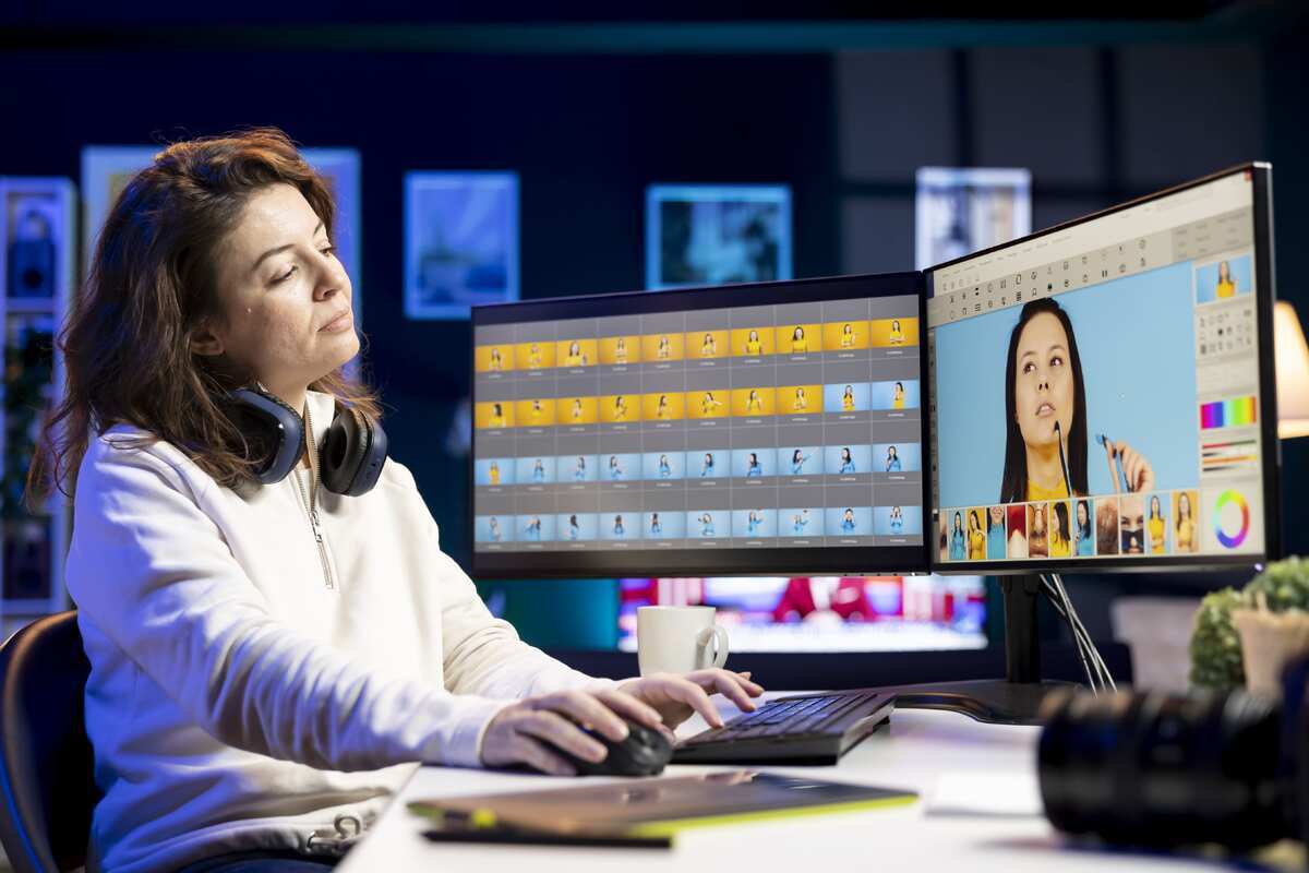
X-Design: An Excellent Tool to Create Better YouTube Thumbnails
The modern generation is behind the popular, fast tools for getting the work done. X-Design is one such platform that is making the process of making YouTube thumbnails faster and more convenient. An AI agent of X-Design allows you to create a poster that grabs the attention of the viewers at a glance.
Check some highlights that make it unique:
The free version is available for cost-effective use.
Layered editing is available to fine-tune the designs.
Easily design for different screen sizes in no time.
Final Thoughts
Ultimately, you get all the essential elements of a good YouTube thumbnail. It is not just one thing, but rather various additions. With the right design, it has the potential to add clarity in a crowded feed. In general, the best thumbnails stop the scroll because they communicate. Not the whole story. But one strong idea in seconds. An impactful YouTube thumbnail sparks curiosity without any confusion. They will feel human to you and not at all forced.
Therefore, utilize an understanding of how people scroll, view, and make decisions. It will help you to create a powerful thumbnail as a growth tool. So, keep testing and simplifying with the X-Design AI poster generator. It will help you design the YouTube thumbnails that get clicks quickly.